Flex: A Toggle-Style Column Component for Your Views
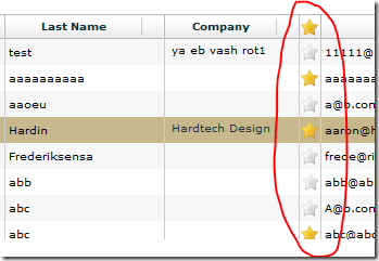
Adding even more functionality to Flex "view" I've been building I've now added a "toggle column" to the list of available column types:

The idea is simple. You click the icon in the column to toggle a field value on the back end document. The icon in the view is either on or off and is dictated by the value stored in the field. It's an idea I've mentioned before which I've now made into a re-usable and customizable component.
In this example I'm using the idea of being able to mark certain contacts as favourites and you can see a working example in the Contact Manager app. The component itself can be re-used in almost any scenario though.
Adding a toggle column to a View is as simple as adding one line of XML to the View's configuration, which is specified in the backend Domino database, as discussed previously.
The XML looks like this:

As you can see it's fairly easy to configure and customize. You can easily change the icon, field name and what the "on"/"off" values should be for the field. You can also add a tooltip for the column.
The Column value of "starred" refers to the name of the XML node of each document which holds the field value we're interested. When the grid is first loaded it will show the icon as on or off depending on the value in the "starred" node.
Clicking on the toggle column on sets the value of the field called "Favourite" to "1". Clicking it again sets the value to "".
To see the XML used in the demo open the Contacts view as XML. This is the XML format that defines the structure and data of the View component. Simple, no?
Taking It Further
If you want to go further than simply modifying a single field at a time and want to perform a more involved action then you can do what I tend to always do and add a self-referencing "computed for display" field to the backend Domino form called something like "Action". In the WQS agent you can then check the value of this field. If the value is something like "Approve" then you can run a set of actions against the document.
In this scenario the XML data for each row just needs to define a true/false value to let Flex know whether to show the icon as on or off depending on whether it's approved or not. The value for the fieldValueOn would be "Approve" and for fieldValueOff it would be "Unapprove". The actual XML data for approved documents would be "Unapproved" and for unapproved documents the column value would be "Approve". If that makes sense.
Summary
It's the simple little components like this that show how powerful Flex can be once you get going with it. With the View component and the components I'm adding to it I feel like this is getting to the point where it's a viable product that can be re-used in live applications. In fact I already am using it in live applications for paying customers.
In the next couple of days I'll update the downloadable version of the app with updated Flex source code. Before I do I want to blog about another addition to the code -- the ability to store a user's choice of columns across sessions using the Flash/Flex equivalent of cookies - the SharedObject. Give me a day or three.
Good stuff Jake. Thanks!
Reply
In screenshot of list the data for the first row item data is written in Russian.
It has a meaning of very-very rude russian curse, think of f*** word, even harder, you'd better change the data with something else.
Reply
Thanks for letting me know JabbyPanda. I've modified the screenshot now and will try not to include text I don't understand from now on ;o)
Reply
I am sorry to bother you one more time, but currently the text in 1st row of "Company" column that is written in Latin symbols transcript from Russian language says the exact rude message =)
Reply