CodeStore Logo in Punched-Out Letters Using Fireworks
Xander posed the following challenge:
I've seen websites where the site name is written in big letters across the site in the same colour as the page background but shadows have been added to the inside of each letter to give the illusion of the site name having been stamped into the page background.
I think it looks pretty difficult and something that you would really need a package like photoshop to do.
Can Fireworks do this?
Easy enough. Let's see how I'd do that for codestore.
First thing I'd do is draw a rectangle in "codestore blue" and write codestore on top of it in the "codestore font" (AKA World of Water).
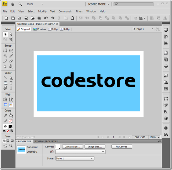
In order to manipulate the text we need to select it and then right click and choose "Convert To Paths". Then right click it again and choose Ungroup. You'll end up with a vector-based shape for each letter, as below:
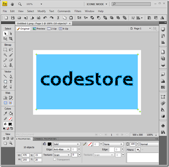
Now, de-select all the letters and then select just the C along with the rectangle. Then, from the Modify menu choose Combine Paths -> Punch.
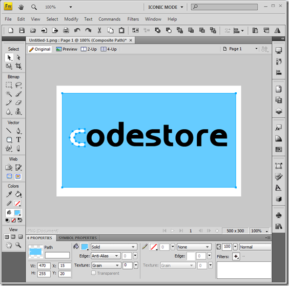
That just knocked out a C-shaped hole in the blue rectangle. Now select the O and the rectangle and repeat the last step.
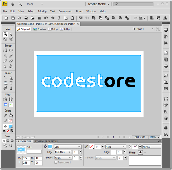
Keep going until all the letters are punched through.
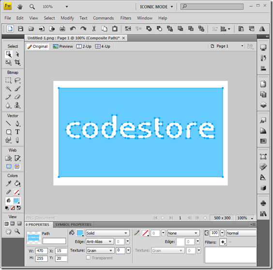
Now from the menus choose Modify->Canvas->Canvas Color. Change it to the same as the rectangle.
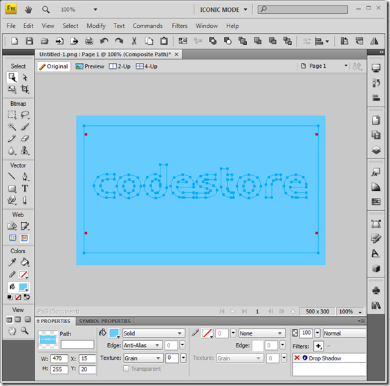
All you need to do now is add a Drop Shadow filter to the rectangle and you're done.
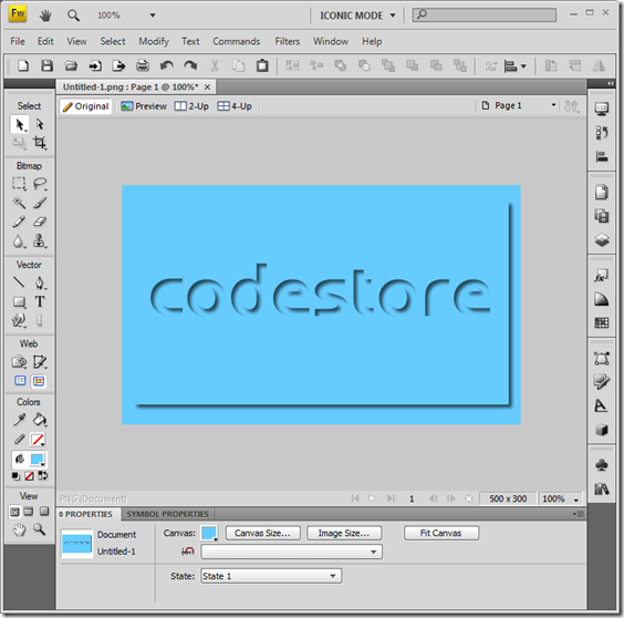
It could probably do with a bit of tweaking to make it look just right. To me it only looks like a punch out if you get close enough to the screen. From here it look a bit like raised "bubble" letters.
Is that what you meant Xander?
This was time-consuming more than it was difficult. As with the other examples I've posted, it's just a case of knowing what all the tools do and knowing how to apply them and in what order.
UPDATE: It's been pointed out in the comments that this is a ridiculously over-complicated approach.
The best way to do this is write your text in the same colour as the background and then simply add an Inner Shadow filter to the text itself! So simple, it hurts. You can even change font!!
I hope your "usual" graphic designer is keeping an eye on all this!
Reply
I don't think he's got much to worry about.
Being able to produce a copy of something is easy enough. Where I fall down is in turning a blank page in to something amazing. That's where he comes in.
Reply
Actually, you could write the text in the same colour as the background and just add an innershadow effect to it :)
P.S. I use Fireworks almost daily, as it's much better than anything else I've tried (including Photoshop) at designing/prototyping websites.
Reply
DOH!
Not only is that so, so much easier it has the added benefit of leaving the text as text, so you can change font face, styles etc.
Reply
Spot on Jake, you make it look really easy. The only thing I would have done differently is add some sort of thin border line around the letters to make the non shadowed side stand out from the background colour while still giving the effect of being sunken.
Top notch...
Reply
Even with the easier way to do this, your example showed me something that I was trying to figure out some time back that I finally gave up on.
Thanks brother!
Reply
Cool. That's why I left it in there, despite it being mis-information. As you've found it does show a couple of techniques that might come in handy.
Reply