Pointing Users In The Right Direction
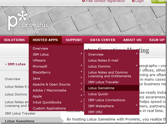
If you visit Prominic.NET's website, which I re-designed for them a couple of years back now, you'll see you can navigate to any page, such as the Lotus Sametime page, using the top-most menu, like so:

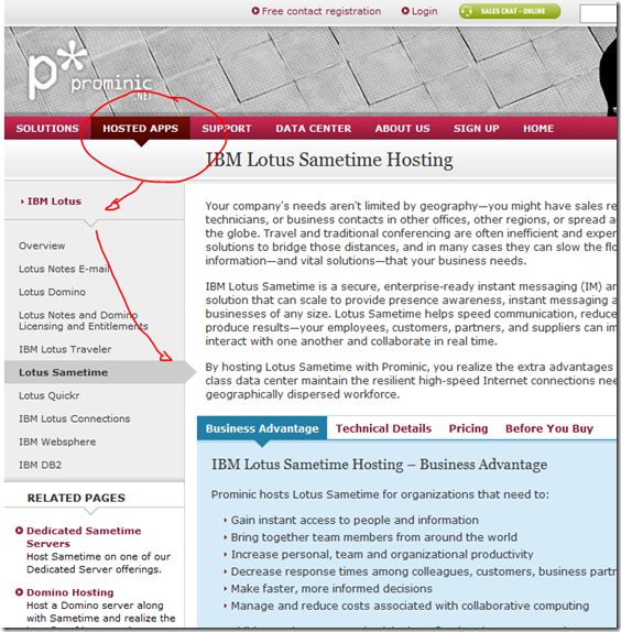
The page you end up at looks like this:

You'll notice lots of arrows in use. Did you also notice how the structure of the menu is reflected in the design of the page? The Sametime page is a part of the IBM Lotus section which, in turn, lives in the top-level Hosted Apps section.
The idea of all the arrows is that it helps the user to quickly figure out exactly where they are at any one time and they can navigate back up the page hierarchy by following the arrows in reverse order.
Since working on the Prominic site I've been seeing these arrows appear in more and more places. They're a nice addition to any site. Not only from an architectural stance but they also look quite nice.
Last week I needed to design a new website. Whereas normally, as with the Prominic website, I delegate design work to the graphic designer I work with, in this case money was tight so I had to do it myself. Normally I'd find this a daunting task, but in the end I enjoyed it and felt quite happy with the end result.

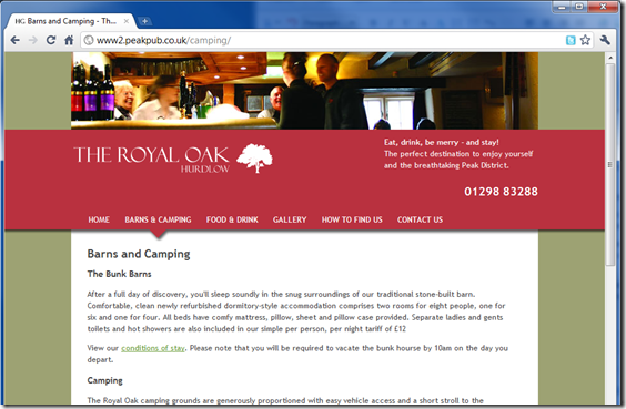
In essence there's not much to the site - a central white column of content on an olive-coloured background and a mauve header. Getting that far was easy as I'd been sent the Adobe Illustrator file the printers used to create the pub's paper leaflets, which used the same colour-way. To take it a little further all I did was add a slight drop-shadow to the header bar and then add an arrow below the selected menu item. These two simple steps turned a boring lacklustre design in to something with a little more appeal. Tomorrow I'll show you how - using Fireworks and some CSS - you can do this too.
Im really looking forward to the next blog entry re: using fireworks/CSS to do the arrow/dropshadow
All neat things
Reply
Thanks for the visual. It's good to see usability in practice. It's refreshing to be thinking just about design especially as I'm trudging through the bowls of much server side code today. :-)
Reply
To bad the nice design isn't a "real Domino app". (my guess)
Seems to be flat html files (pages) imported into a domino database only used to store them.
Not a single "calculated" domino url as far as the eye can see :-(
Reply
Which site are you referring to? Prominic or the pub one?
Prominic's site is pure Domino. No pages. Just document-driven forms and views.
The pub site is LAMP-based.
Reply
Regardless of whether it's Domino it's a concept I'm talking about here and the CSS/images used are the same no matter what the database/server used is.
If it makes you all happier I can stick it all in a working Domino database to download?
Reply
Bear in mind that with good technique, you wouldn't know you were using a Domino application at all if one wanted to disguise that fact. You might enjoy exploring web site documents.
As Jake says - this is LAMP anyway and I think you might have missed what was most valuable about this post: usability through creative graphic design. Domino is irrelevant to that point on it's own.
Reply