Creating Navigational Menu Arrows With Adobe Fireworks
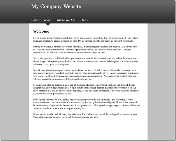
Yesterday I talked about how and why I'd used a small downward arrow on the navigation on the website below in order to add a little finishing touch to it.
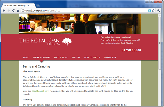
Today I'll talk about how I did it.
Creating The Site in Fireworks
First thing we need to do is create a new document in Adobe Fireworks (you can use any graphics editor, as the principles are the same) and choose a custom canvas/background colour.
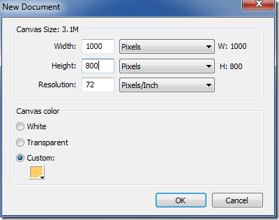
Then, on the new document, add two rectangles - a white one in the centre which is the full height of the canvas and another one at the top which is the full width.
Then add some text to act as the content - a title, the menu items and the body. You should end up something like below. It looks a bit like a website. But it's very boring.
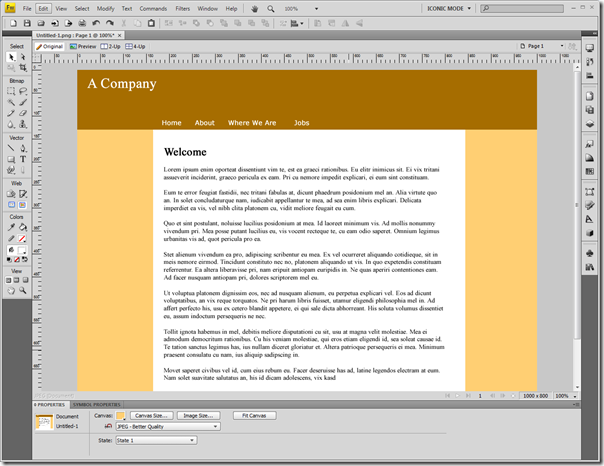
To make it a little bit more interesting we're going to add an arrow.
Creating The Arrow
First thing to do is add a small square of the same colour as the header area. To make a square you just use the rectangle tool and hold down shift while drawing the shape on screen to make the sides of equal size.
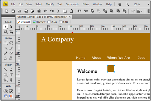
Now we need to rotate the square by 45 degrees, which we do using teh Numeric Transform tool from the Modify -> Transform menu or pressing Ctrl+Shift+T.
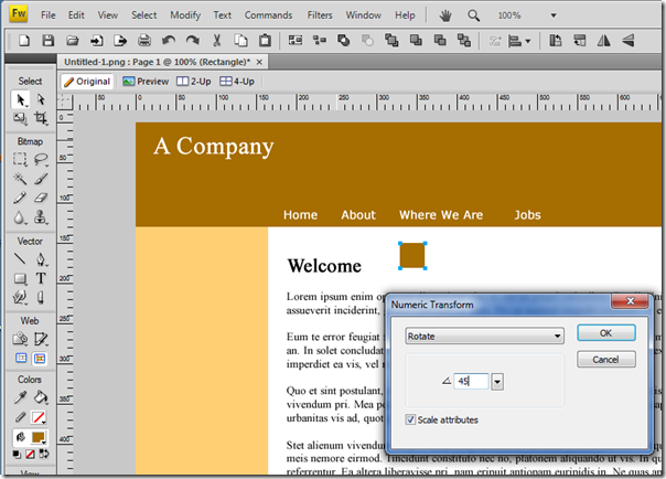
Choose Rotate and enter 45 in the angle box and press OK. You can then drag the rotated square up to the menu area and align it with a menu item and move it about until you have it looking just so.
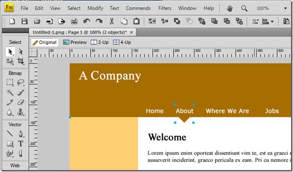
Now we need to select both the header rectangle and the small square by holding down shift as we click on each. With both selected you can merge the two shapes by choosing Modify -> Combine Paths -> Union from the menus. You'll then have a single vector-based shape like the one below:
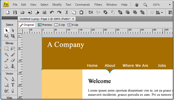
Any change to the colour or fill of this single shape will now affect both the arrow and the rectangle. More importantly though we merged the two shapes so that the drop shadow applies correctly, as you can see below:
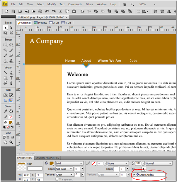
What we end up with is a design like this. Still a bit boring, but not half as boring as the design without a shadow or arrow!
Once you've played with the colours and maybe added a gradient fill to the header you'll end up with something you're happy with, like this:
Now we need to export the images we'll need to use with the CSS to achieve this look. Add three export slices as below:
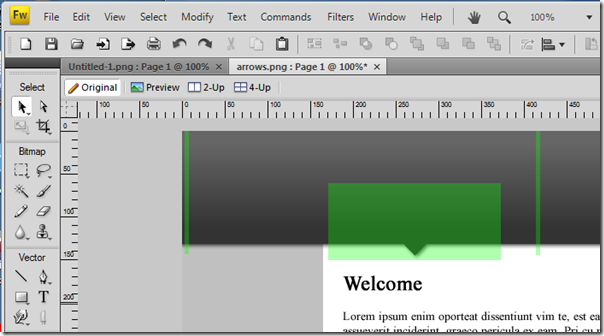
The two thin slices will make the repeating background image of the body and the header area. The larger slice will become the background to the menu items.
The three images should look like this:
1.  2.
2.![]() 3.
3. ![]()
Tomorrow I'll show you how to use these three images with a sprinkling of CSS to create the design above in HTML. I was hoping to do that all today but this is taking too much of my morning up already...
If you fancy a tinker in the mean time here's the editable Fireworks PNG file which will show you how I did what you see above.
I'm looking forward to seeing how you use that wide graphic close to the 'margin' where blotter color and paper color touch, say with a short first link like Home. Patience is a virtue, so I'm told. :-)
Reply
It's brilliantly simple. Although I do have to admit I stole (possibly the wrong word as in fact I paid for) the CSS from the Prominic design. It was designed by the graphics guy I use who then passed it to his CSS guy who provided me with HTML templates to use.
Reply
Yet another wicked post. I should send you one of those buttons from Staples that talks out "Its that Easy"
Keep em coming
Reply
Great article brother! Can't wait til tomorrow.
Reply